Useful Unity UI #001: Beasts of Balance Bestiary
This is possibly the first entry in a possible series of entries where I will take a quick stab at recreating a cool UI effect in Unity. Sometimes it’s the simplest effects that can have a big impact, and make your interface jump from workmanlike to downright appealing. For this entry, I wanted to highlight a neat concept within the collection display of the game, Beasts of Balance.
The Inspiration
Beasts of Balance is a really clever game that coordinates physical pieces with an app. Most concepts like this just feel gimmicky, but this one is very well done and we have played it often in my house.
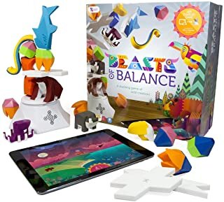
The Beasts of Balance game
Part of the game is creating various beast combinations in each successive game that you play. Each new creature you uncover is recorded in the app’s Bestiary, and that’s the piece I want to focus on.
Watch the video below to see the bestiary open up and reveal each discovered critter. Please note that we use a very old iPad to play this game, so any frame rate hiccups in this video are most likely all the fault of this old device. I am sure it is smooth as silk on something that is less than five years old.
Quick clip showing the Beasts of Balance Bestiary opening within the app
Looks pretty slick, right? Each beast is unveiled smoothly inside of a hexagon. The cool part is, this is pretty easy to do, and it’s a technique that is easy to apply to any group of UI elements you might want to animate into place. I think this is a particularly strong technique for a collection manager like this, and even stronger with this flat-shaded 2D art style Beasts of Balance is rocking.
The meat of the collection reveal effect comes in the animation of each creature’s hexagon display. Having each item scale up from zero--perhaps with a little jiggle to make it cute--isn’t too uncommon of a practice when revealing a grouping of UI elements. In Beasts of Balance, however, what is happening inside the hexagon makes it look a little cooler than usual.
As each item scales up from nothingness, the creature inside is scaling smaller to fit. It’s as if a small camera is zooming out to capture the full size of whatever dwells inside the hexagon. To me, this simple effect grabs the eye and makes me want to study what is in each item a bit more closely; a nice attention grabbing technique that is easy to pull off.
The Recreation
First of all, I decided to create my own little critters for this, and I regret it. I should have just snagged some Kenney assets and moved on, but here we are. Everything in this example is intended to just quickly show some techniques, but doesn’t show the usual polish I would apply to an interface like this (with help from actual artists). Also, since my intention was to highlight elements of the bestiary’s methods, I kept the opening screen as bare bones as possible.
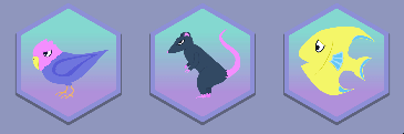
Programmer art creatures doing their thing
The key to getting this effect in place is using effective masking within each collection object. To make this easier, each collection item is created using a prefab with all elements in place. Some of these elements may not be necessary depending on the look you’re going for, but I was trying to hew pretty closely to what Beasts of Balance is doing.
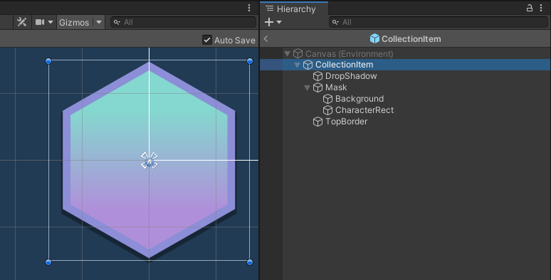
The setup of the collection item prefab
Note that I have the drop shadow layer at the very back, and just above that is the “Mask” layer. This mask contains the masking shape I want to use (a hexagon), and its children will be masked out accordingly. Its children being the background and the “CharacterRect” object, which will have the character sprites appended at runtime. Then on top of the mask, lies the border that will hide the edges of the masking with a nice frame.
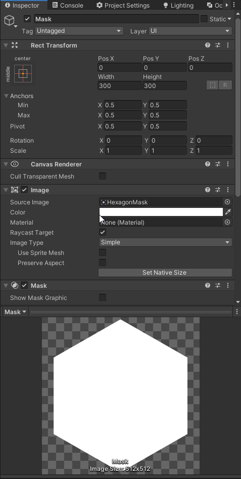
The mask image settings
This setup allows the character’s image to extend beyond whatever the current size of the hexagon is, but be masked so that just the portions inside the hexagon are visible. There are a few different masking options available in Unity now, and some are better for different situations. For this setup, the classic Mask component seemed to be most appropriate.
At the top level of this prefab, I have also applied an Animator component. This component will animate the sizing of the collection item. Note that using a separate animator for each of the items may become a performance bottleneck, especially when we’re also dealing with a scroller. If you actually use a technique like this in a project, refer to this excellent guide to clean up any of these slowdowns.
When the user enters the collection, a BeastsCollectionCanvas.cs script clears out any existing collection items and spawns in new ones to fill up the scroller. My simple script allows you to set the number of items from between 10 and 100, and it will just randomly use one of the three critters I created for each one. I also allow the time between each character’s reveal to be varied, and this just allows for a slow uncovering of the whole collection, similar to Beasts of Balance.
Despite my programmer art, I think the reveal effect comes across well and it illustrates how easy it is to pull off an effect like this in your own project.
Refinement
Maybe I’m being a little tough on my own art—the first thing to be overhauled—but there are other things to fix up as well. If I were to implement this into a real project, I would create a better transition from the main menu into the collection. For now, it just pops from one to the other, just like Beasts of Balance does. Does anyone notice this while playing that game? Probably not, but it’s something I would personally try to smooth out.
The text here is a bit washed out, and I would probably try swapping to TextMeshPro in place of the standard UI text elements. I must note that I am pretty sure I am using the exact font used in Beasts of Balance, which I just stumbled into while looking for something similar. It’s a really good font, and free to use!
There are also many optimization tactics I would put into this project, even before a slowdown was apparent. Again, this link is a great checklist to go down periodically when developing a user interface with Unity. It’s hard to get too into the weeds on a sample like this since there is no definitive architecture that this fits into at this point, so I treated it all as a simple standalone project.
Take a look through the project and its hierarchy to see how each piece fits together if you’re interested. Feel free to borrow any of the code or pieces that will make your life easier too! I have no plans to extend this into a part of any current projects.
Also, if you have any cool UI effects you’d like me to try and recreate, I am up for a challenge. Please leave a comment with your suggestions/requests!
Bonus Note
When prototyping, I often use a little trick to not add a bunch of cruft to a project early on. Sometimes, this trick even gets used in final versions of a project depending on the platform and style I am working with--it’s very mobile friendly!
If you need a nice looking background quickly, you can create a texture that is 2x2 pixels. Then use different colors to get a nice gradient effect when the bilinear filtering is applied. This is the tactic I used on the background for the characters in this sample project. You can also just make it a 1x2, but I like to go ahead and get rid of any Power of Two warnings in the inspector.
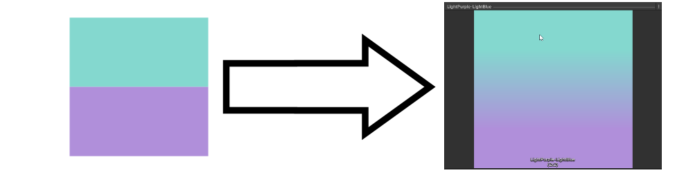
Space saving gradient background
I have fallen back to this little tactic while frantically finishing game jams, but also when prototyping. When used in the right situation, it can look good enough to stay in a production release.


